Showing posts with label web. Show all posts
Detailed Panoramic Photo on the Web
Gerald Donovan created the first panorama photo from the top of the world’s tallest building. The 2.6 GB, 360-degree panorama was shot at the Burj Khalifa in Dubai.
It was stitched from 70 photos (80 megapixels each) allowing the viewer to manually rotate and zoom to pretty much every point in the city viewable from the tower.
The image was created to promote the second Hamdan Bin Mohammed Bin Rashid Al Maktoum Photography Award (HIPA), the world’s richest photography award.
New Image Format For Web
Commonly, we use JPEG of PNG for images on the Web. These two image formats technically work just fine until the introduction of high-definition screens of mobile devices, which prompted web designers to reconsider the efficiency of these format usages for the Web.
In short, a high-definition screen requires twice the regular image resolution and size; otherwise, the image could be pixelated. There are, however, a few consequences regarding that matter: first, for users who have low Internet connection speed will need to wait for the website to load (really) slowly. The images will also take more space in web storage, which eventually will also consume much of the bandwidth.
Recently, Google proposed a solution: a new image format for Web called WebP. This format offers image clarity while maintaining a smaller size than that of JPEG and PNG. Let’s take a look at the WebP image format.
WebP Comparison
In this example, we compare an image by Rula Sibai in three different formats.
As you can see above, the images above look almost of the same quality, yet the size for the WebP format is the lowest of the three.
Furthermore, WebP supports Alpha channel that allows us to create transparency on the image, which is great for creating an image logo. Here is an example and the comparison.
WebP Tools
Unfortunately, many image editors – except Pixelmator – does not support WebP format at the moment. But, there are already a few tools that allow us to load, create, save and convert JPEG, PNG, and other image formats into WebP format.
WebP for Photoshop – This is a Photoshop plugin that allows you to load and save your image in WebP format.
Convert to WebP – This tool converts JPEG and PNG and other format into WebP.
WebP to Other Format – This tool changes WebP to other formats.
Gimp For WebP – A plugin for Gimp to support WebP format.
WebP Codec for Windows – Using this codec we can view WebP format in Windows natively.
Sadly WebP support is not widely supported by most browsers yet. Currently, it is only Opera and Chrome that support the WebP format natively, while Firefox is still considering it.
For full list of WebP browser support you can head over to the following page.
Final Thought
WebP seems to be a promising image format for Web in the future. Despite the lack of support, there are a few advantages on using WebP:
The image size is a lot smaller, We could save much storage space and bandwidth with smaller image sizes.
Since WebP size is smaller than JPEG and PNG as in our above test, the image will likely load faster.
WebP is a lossy image format like JPEG. But, unlike JPEG, WebP supports Alpha channel that allows creating transparency on the image. So, rather than using PNG and JPEG, we can simply use one format for our web images.
Further Reading
WebP, a new image for the web – Google Developer
WebP on Chromium – Chromium Blog
Access the Twitter Web with Analytics Tool
Twitter Web Analytics Tool can be accessed by every Twitter user now. Twitter will always remain the original pro in the run of social networking sites. This social networking platform never lost the charm among its lovers and day by day, it is making the product more powerful and friendly for marketers and businesses of all size and all kinds.
 |
Twitter Web Analytics Tool
The recent inclusion of ‘Twitter Web Analytic Tool’ for all the users will now enable everyone to analyse the ‘Social Compliance’ of their tweets. Earlier, available solely for the Twitters’ Advertising customers, it helped the business users a lot to track the status of their tweets and plan marketing campaigns accordingly.
What’s the use of Twitter Web Analytics Tool?
With the new tool, anyone can now measure the performance of his or her tweet. Let us see what this Twitter Web Analytics Tool is all about in details:
Users now get the full access to the humungous data about other people, user groups, and brands, who follow them. The main aspect of importance is the ‘Timeline Activity’. Timeline Activity is a graphical view of the total number of ‘mentions’, ‘follows’, ‘unfollows’ that the user has received in the last month. Below the summary list, there is a detailed list mentioning about the user’s most recent tweet.
The Timeline Activity can be refreshed in certain incremental interval (for example every 6 hours). The monthly details are also available as weekly details, along with fetching the data of the same day. Before Twitter Web Analytics was made open to all, there are certain Twitter analytics tools already in use. However, the accuracy and authenticity of the data and information was a matter of concern always. Now, people can easily get accurate data on the performance of their Twitter profile as well as the tweets they make.
If we look at the benefits, marketers can make use of three major aspects –
Information on the volume of traffic Twitter is following in to the publishers’ website
Insight on the nature and intensity of engagement a Tweet button is producing on the website
Understanding of content sharing strategy throughout the social networking site.
Well, now another aspect of importance is how to use the Twitter Web Analytic Tool. Here is how you can log in to the tool:
1. Go to Twitter Ads and log in to your account.
2. Next, click the ‘Analytics’ button and choose any of the 3 options. You’re done.
Now, you can see all the data of your Twitter account. Twitter Web Analytics was a much planned out effort by the company, which has started with the acquisition of BackType. BackType provides all the technology support to make the analytics happen.
Should I use the Twitter Web Analytics Tool?
Marketers and business owners have always loved to see the analytics data of their Twitter activities. This has always helped to gain better insight of their customers’ viewpoint. The social media revolution initiated by Twitter always needed an analytic tool for the marketers to better understand, plan, and execute their campaigns. Now, with the tool becoming open to all, will enable general twitter users become aware of what is happening around their Tweet ecosystem. So, now you also get ready to bring that social impact in your Twitter account and make your profile socially compliant.
Ok friends, here I want to tell you something important. Actually many of us are not yet able to view the analytics. Even Avi told me that he was unable to view analytics at first but he finally found a way to get access to the analytics.
At first I was not able to access Twitter Analytics.
Every time I click on Analytics > Timeline Activity and I was taken to the same Ads promotion page. Then I asked some of my friends if they were able to view their analytics. None of them were able to view anything except the Ads promotion page. I also read blogs like Mashabe but didn’t find any clue. Finally I tried to make it out in someway.
What I actually did?
- I clicked on the “Account and Billing” option at the top right and selected “Billing History”.
- Then I was taken to the billing page.
- Then I clicked on the “Switch to Advanced” option.
- This brought up a popup which was showing Basic account v/s Advanced account features.
- And as I clicked on Advanced I became an advanced account users and finally became able to view my Twitter account analytics.
Actually the thing is, many of our ads account is still in basic mode and so we need to get in to advanced in order to view the analytics. As told in the above ic that only advanced users can get access to analytics and so I was not seeing analytics before when I was on basic plan. But the roblem has been solved now. Wow! 
Hope you liked the article and I’m sure you will enjoy viewing your Twitter Analytics. 
10 SEO Also Can Constructing your Web Page
In order to receive as much traffic from those search engines it is vital to make up the web page correctly, immediately from the start. Below follow 10 tips and pointers on how to do this the right way.
1. Proper SEO use of the “Title” tag
The Title tag is a standard part of the HTML make up of any web page. It usually is the first text spiders from search engines read when visiting the page. Therefore, it is important to know that most search engines only read the first 73 characters of a title, so make sure that your main keywords or key phrases are located in those first 73 characters.
2.meta tags
Meta tags are special HTML tags on a web page that contain information for spiders and bots. Even though large search engines like Google and Bing no longer read them, but lots of smaller search engines still do and therefore it is still important to include the meta keyword and meta description tag. It should go without saying that in there your main keywords and key phrases should be present.
3. Make search engine spiders revisit
Once your web page has been discovered by the search engines it is important to make sure they revisit the page within set intervals of time. For this a special meta revisit tag is used. Normal usage sets the revisit value on 14 days, but if your page updates frequently it is allowed to set it to a shorter period, like 7 days or less. This way you get more control over when your updates get indexed by those search engines.
4. First text
Now your tags are in place it is time to put up the first paragraph of text on your page for search engines, like google and Bing who do not read meta tags. Those search engines will take the first paragraph of text instead. It is important to know that from this paragraph only the first 143 characters are actually read and indexed by search engine spiders, so make sure your main keywords and key phrases are in the first part of the paragraph.
5.Keywords
With the above tips and tweaks we have the basic structure ready, so now it is time to write up the rest of the content and use your keywords and phrases correctly. With the recent Google updates it is important not to repeat your main keyword too often. A keyword density of one percent usually does the job just fine, while overusing them will actually hurt your rankings. For example, if the content of your web page consists out of 500 words, repeat your main keyword 4 to 5 times maximum and you will do fine in terms of ranking and indexing.
6. keyword variations
When you picked your keywords, and did your homework you also made a list of synonyms of those words, to use in your content. This way you can catch and rank for all variations of your keyword, and make optimum use of the SEO power of your web page. For example: If you have page about guns, you can also use pistol, rifle and other variations to beef up your text with added SEO power.
7.Keyword stuffing
Not so much a tweak but a word of warning: Don’t use keyword for the sake of adding keywords. Make sure your text makes sense and remains easy to read. Overdoing it will be picked up by the larger search engines, like Google and Bing and it will penalized with lower rankings or worse de-indexing of the entire web page. So use common sense and keep your readers in mind, even when adding SEO elements to a page.
8.Unique text
When writing for search engines always ensure your text is unique. Copying and pasting texts partly or in whole from other places will get recognised by the search engines and your page will be penalized for it with lower rankings.
9.RSS
Really Simple Syndication(RSS) can be a powerful means to get your web page listed on the search engines fast as well as get some fast traffic from other sources. If your site has the ability to use RSS feeds, make sure to enable it because search engines index those too and so called “RSS aggregators” might pick the feed up.
Social media
Once your page is ready and optimized with the above tweaks and pointers, be sure to publish them on sources like Twitter and Facebook. Search Engines love social media sites and will find your new web page almost instantly once you posted a link on there. In case an RSS feed is present you can even automate this process by using services, like Feedburner.
10.Always do your SEO homework.
The above tips, tweaks and pointers assume you already did your homework and have done the appropriate research in order to find all relevant keywords and key phrases as well as their variations ready before you started constructing your web page. Preparation is half the work, and this hold particularly true when it comes to optimising your sites for the search engines.
Web Traffic and where you can get them?
A lot have been said about web traffic, every webmaster and blogger knows the important of web traffic to a website/blog. Without web traffic to your site, that site is as good as dead no matter how well designed it may look. There are different types of web traffic and also different sources, while some focus on one more than the other I will recommend otherwise in this article.
There are basically three different types of web traffic namely organic traffic (from search engines), direct traffic (when someone directly types your site address on the browser) and referral traffic (from links all over the internet). It is ideal to drive traffic to your site from all three different types/sources of web traffic because search engines see them differently and have different valuations for them as well.
Types of Web Traffic
Organic Traffic: Organic web traffic is the type of traffic that comes when your article is found on the search engines and followed to your site. This is the best form of web traffic as even Google and other search engines have confirmed. Organic web traffic is considered most important and often valued more than any other type of web traffic. It also has a higher CPC than the other types of web traffic named earlier in any PPC campaign.
How to get Organic Traffic: To get organic traffic you need to publish quality articles on your site, optimize them properly with good keyword usage. When you rank high on the search engine results then you’ll surely see a lot of organic traffic to your site. This type of web traffic requires a lot of hard work and takes time as well, but I assure you if you learn the intricacies of writing a post that will immediately appear on the first page of Google search result or any other search engine you will see how easy it is to drive traffic to your site for free.
Referral Traffic: Referral traffic is yet another type of web traffic as a result of the backlinks you have built all over the internet, when someone follows your link from another website to your website this type of traffic is termed referral traffic. This could be as a result of links you left via blog commenting, guest posting, social media sharing etc. Referral traffic constitutes the second/third source of traffic to my blog after organic traffic.
How to get Referral Traffic: Referral traffic as I explained is as a result of the links you left all over the internet as a result of blog commenting (especially on blogs with CommentLuv plugin), guest posts, social media shares etc. It could also be email signatures, forum signatures, link exchanges, content curation like from Scoop.it, from lists like List.ly etc.
So if you want to improve your referral web traffic then you have to take these things seriously, don’t concentrate only on your own site, help others promote their site by commenting, sharing and guest posting, that way you can attract same favor and the more links you have out there the better for you general site traffic. Remember not to spam as Google won’t hesitate to de-index your from their search engine. Please avoid all black hat SEO methods, concentrate on the types of link building strategies I have shared on this blog in the past.
Another type of traffic would’ve been the Social Networks traffic but most times its little and is easily parsed as referral traffic. But if you have a very active social media page, you can drive huge amount of traffic from there to your site. Do not ignore the potentials of the social media in promoting any brand or product in this case your website.
Direct Traffic: Direct traffic is yet another type of web traffic but not from search engines as organic web traffic discussed above. When someone directly types your site address on the browser address bar and hit the keyboard enter button and arrives at your site, such traffic is what is known as direct web traffic. This type of traffic is mostly associated with popular websites, when you have promoted your site very well and have built yourself a brand then people can remember the name of your site easily and visit your site even without seeing the link anywhere. This type of web traffic often constitutes the second/third largest source of traffic to my blog after organic traffic.
How to get Direct Traffic: To get more direct traffic to your website you have a lot of branding and promotion to do. You have to become popular for people to remember your name. Let me let you in to a secret that works always. Print your website name on a T-shirt and share it to your friends let them wear it always and people will see it and over time will remember the name. You can also create stickers; a little charity will also be good. Create banners; use your site name as your Facebook cover image etc.
General advice: As more and more of your contents are being published, try as much as possible to adequately promote your contents, build links the genuine way and over time you will begin to reap the result of your hard work. Publish only quality articles, well optimized for search engines and engage productively on the social networks, join as much as you can handle and make new friends, join groups and help others to be helped as well.
These methods I shared here in this article have greatly improved this blog and I assure you it will also improve yours. Now you know the types of web traffic and how you can get them, take advantage of my advice and improve your site traffic. Let me hear what you think of this article, use the comment section below to share your taught and also don’t forget to subscribe to my RSS feed so you won’t miss interesting posts link this one.
How To Avoid Web Design Mistakes | Quicktips
Every web designer tries to design an effective website, without making any mistake. But, it is not at all mandatory that all the trials give effective results.
Some websites exists on the internet which has lots of mistakes or errors in it and these errors distract the users from the site.
Some of the common errors which designers make and due to which the users distract from the website are:
1. Unpleasant color combination
2. Too large and too small texts
3. Loading of web pages takes time
4. Pop-up windows
5. Failure in opening of external links in new browsers
Every business owner develops the website of his company with the main motive to earn profit by attracting the visitors towards their site.
In other words, they develop the website to build the reputation and credibility of the company.
To build the reputation and credibility of the company, it is necessary that, the web designer must design the website which enhances the user experience.
A visitor should feel comfortable, when he/she visits your website and he will feel comfortable only when your website is attractive and informative.
This will insists the visitor to visit your site again and again for getting updated information or more information regarding the same topic.
Described below are some of the common errors which a designer makes while designing the website.
Unpleasant Color Combinations
The websites which have appealing designs and decent color combinations are enjoyed by most of the users.
Therefore, a designer must not make use of ugly color combinations; instead they must use decent colors, which give soothing affect to the eyes.
For example. The black text with the white background gives soothing affect to the eyes and if you want to make it more attractive then you can add graphics, which will give more colorful appearance to the web page.
Too Large and Too Small Texts
It is the one of the most common mistakes which the designers make. The designers either use very small texts or very large texts on the web site.
It is true that, the use of small texts will give you the opportunity to insert a lot of information on the site, but at the same time use of small texts makes it difficult for the visitors to see or read the content, especially on the high resolution screen.
On the other hand, there are few sites, which uses too large texts, this makes the website unattractive and becomes a curse for the users using low resolution screen like 800X600 pixels.
The solution for this problem is that, you, yourself should check the text by sitting few meters away from the screen. You should be able to read the text comfortably.
Time taken for loading a web page
Every visitor clicks on the website with the hope that the website will load quickly and he will be able to see or get the information for which he is searching for.
But the designers make this mistake by adding heavy graphics or large number of graphics, which makes the loading of the page slower.
And the visitor doesn’t have the patience or the time to wait for the site to get open and that visitor skips from the website.
Therefore, it is one of the greatest problem due to which the businesses lose their online visitors. Therefore, a designer must optimize the images before placing it on the website, so that it loads much faster.
Pop Up Windows
The occurrence of the pop up windows on the site irritates and frustrates the users. The users close these windows frustratingly.
Pop up windows infect your website and give it a low quality appearance.
As a good designer, you must think that you are making the site for the user and you must see his comfortability.
Links Get Fail to Open in New Tabs
External links which don’t open in new tab, gives a very bad experience to the user. As these links enable the users to simply go to the new page without losing the previous page.
The appearance of website must be appealing to the user eyes. Therefore, web designers should design a website without any errors or mistakes and must check it before making it live on the web server.
Corporate Web Marketing Using Seo Strategies
Presently corporate world fully depend on Internet marketing for advertising and management. But interestingly there is no official textbook on proper strategy or tactics of internet marketing. If you are a business owner then it completely depends on you and fully strategies can be performed with search engine optimization (SEO) with professional firm or individual(s).It will be done as you or your business wants. As per my 4 years experience in marketing and SEO consultant, I have applied a lots of new or fully invented methods to maintain corporate web marketing SEO strategies.
It is seen that a large number of SEO professional as well as marketers are doing mistakes in theirSEO strategies. My article tries to find out a few of them. Just check these mistakes and avoid them to start healthy web marketing SEO strategies.
1. Real Time Onpage content strategy:
There was no problem before Google’s Panda algorithm update but time has changed and with out value added content , you site will never come to top in SERP . Just you have to add value able content to your site. Content must be related to your business. A few suggestion about value added content
- Content with quantity and quality.
- Social sharing with quantity and quality.
- Real Time grammar and spelling.
- Real time text formatting.
- Using of subheads
- Informative length of content
- Natural inbound and outbound links
Your first criteria in SEO startegies are valued and informative content which may be ever lasting effective.
2. Poor offsite content strategy:
Offsite SEO strategy normally depends on link building and article marketing. On the other hand inbound links are the heaviest-weighted factor in Google’s ranking algorithm.
As it is known to all that links are like roads to your website which can bring potential clients and customers. So your link building strategies must be white hat and natural. Content marketing (guest posting) is one of the best white hat method of link building.
Using black hat method is the easiest way to shut down your website as well as your business too.
3. Time management Concentration:-
A large number of online marketers fail in their SEO strategies due to lack of time .When you hire some to start SEO strategies then you must be involved in the strategies. This will give more interactive in online community which is one of the most effective path of trust worthiness among the clients and customers.
4. Lack of enough budgets for campaign:
It needs to hire high quality SEO experts to start your strategies such they can do with devotion on your site as well as your business too. So high quality firm or individual can provide your needs .Unfortunately, a large number of low-budget SEO providers are stuck in a pre-Penguin era of Search Engine Optimization helps business owner via spamming (black hat tactic) but it quite impossible now.
5. Unequal distribution of workload:
Now this days , Online marketing is too vast field of business , so it is quite impossible to manage by a single person . That is for why, it is needed to hire freelancer or virtual assistant to distribute your work among them. Work distribution can safe time and energy which can manage more clients and customers.
Conclusion
Your SEO strategies depends on your activeness and willingness. If you hired some one experts but you must monitor their works in real time basis which may be a source of your business success . So my best point in this context , if possible then must try to know your basis SEO strategies .
Awesome Web Design Conferences
Editor’s note: This is a contributed post by Chris Jackson, who writes about web design trends for DesignCrowd, an online design jobs marketplace for freelance web and graphic designers. They have recently launched a design jobs marketplace in Singapore.
One of the highlights of the year for any serious web designer or developer is often the Web Conference. Every year there are more and more amazing events taking place all over the globe, from events all over the US such as the An Event Apart series to SxSW in Austin, Texas, to the Edge Of The Web conference in Australia to events like jQuery Europe and DLD in Germany.
There is something for everyone no matter where you are from. We take a look at some of these amazing web conferences and they may have for you. If you have any other conferences to add to the list, let your voice be heard in the comments section.
Note: Most of these events occur on an annual basis (sometimes a few times a year) so be sure to check their sites for details if you want to paticipate in any of them.
New Adventures In Web Design
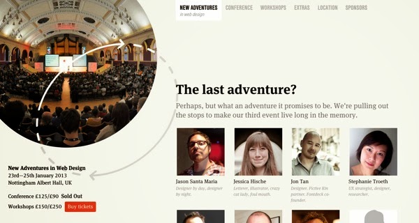
New Adventures in Web Design is a focused, single-track design conference in the historic English city of Nottingham. Alongside the lineup of great speakers for 2013, there are three masterclass workshops on offer from industry legends Sarah Parmenter, Andy Clarke and Steph Hay.
Industry Conf
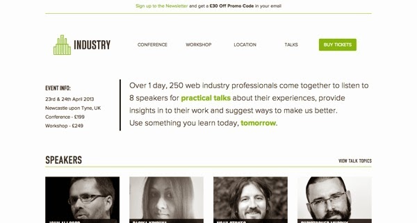
Industry is the brainchild of conference veteran Gavin Elliott, organiser of the incredibly popular DIBI Conference in 2010 and 2011. The event will feature 8 diverse web professionals giving practical talks and giving you the tools to use what you learn from the conference in your own work.
Industry is the brainchild of conference veteran Gavin Elliott, organiser of the incredibly popular DIBI Conference in 2010 and 2011. The event will feature 8 diverse web professionals giving practical talks and giving you the tools to use what you learn from the conference in your own work.

Altitude
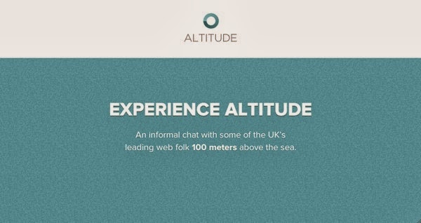
Altitude is a unique event set in a unqiue location: 100 meters above sea level in Portsmouth’s Spinnaker Tower! Web entrepreneur Paul Boag interviews 4 leading figures from four different disciplines – development, design, accesibility, and iOS design – giving conference-goers a broad and insightful view of the industry.
Altitude is a unique event set in a unqiue location: 100 meters above sea level in Portsmouth’s Spinnaker Tower! Web entrepreneur Paul Boag interviews 4 leading figures from four different disciplines – development, design, accesibility, and iOS design – giving conference-goers a broad and insightful view of the industry.

Port80
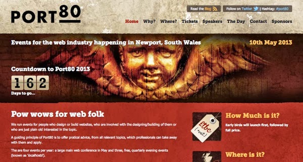
Port80 is organised by Joel Hughes and is Wales’ first web design conference (in 2013). Alongside the yearly main event, there are Localhost events, low-cost evenings that happen three times a year.
Port80 is organised by Joel Hughes and is Wales’ first web design conference (in 2013). Alongside the yearly main event, there are Localhost events, low-cost evenings that happen three times a year.

SxSW Interactive
SxSW is one of the most well-known conferences anywhere in the world, featuring cutting edge music, film and digitil/interactive technologies year on year. Its scale and scope can be daunting to the newcomer, and the handy First Timer’s Guide is a good place to start for the uninitiated.
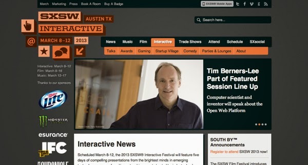
SxSW is one of the most well-known conferences anywhere in the world, featuring cutting edge music, film and digitil/interactive technologies year on year. Its scale and scope can be daunting to the newcomer, and the handy First Timer’s Guide is a good place to start for the uninitiated.

Converge SE
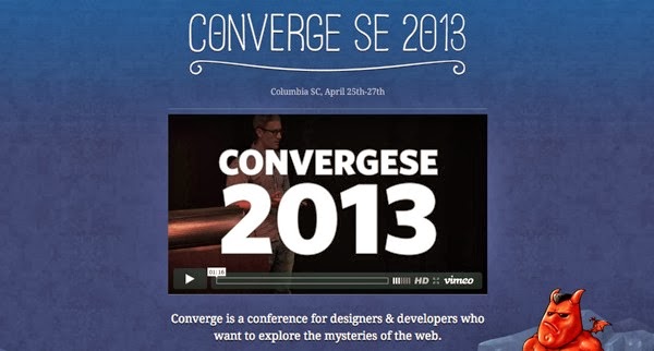
Converge promises a conference for "designers and developers who want to explore the mysteries of the web" – which it does through intensive half- and full-day sessions, in multiple venues all across Columbia. In 2013, participants heard inspirational talks from Chris Coyier, Grey Hoy and James White.
Le Web London
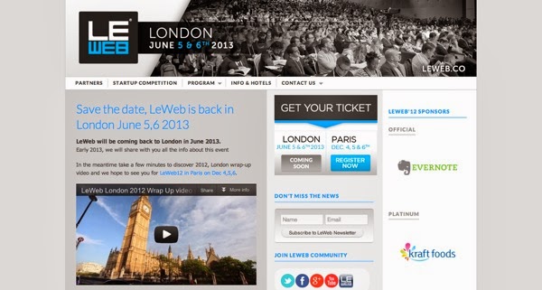
Le Web London is back for the year 2013 with the concept of Digital "Hippies" – people creating a global marketplace where ideas and creations are shared openly, without the usual focus on money.
IUI Conf
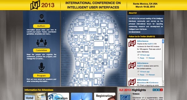
The first IUI Conference, all the way back in 1997, was conceived as a highly selective program focusing on quality. After all these years, the focus remains the same, and the program of excellent speakers will help to inspire the next wave of research into Intelligent User Interfaces.
Interaction
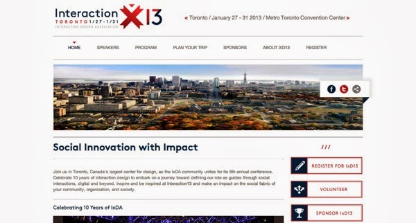
Toronto is Canada’s largest center for design, and is the perfect place to host the Interactionconference. Already breaching 10 years since the founding of IxDA, the web conference celebrates the interaction design community with various workshops, sessions, panel discussions, "Idea Markets", and more.
An Event Apart
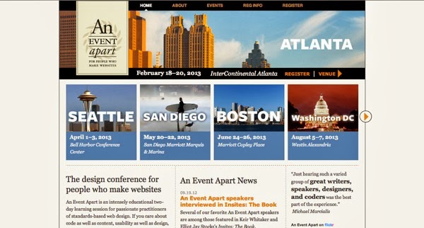
An Event Apart was founded by Eric Meyer and Jeffrey Zeldman, and is dedicated to the idea that creators of great web experiences deserve a great learning experience. Every event, happening all over the US, promises to be just that – with a range of speakers and sessions all happening in the one room.
Mobile+Web DevCon
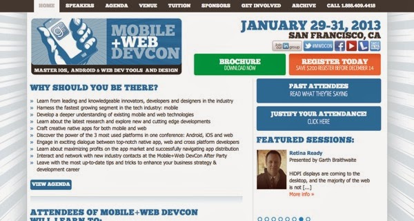
This mobile conference is split over three days, with the main conference happening over two. Prior to the conference, atendees can take part in the Labs, where they can learn a range of skills from mobile design and client/server iOS apps, to getting your teeth into JavaScript (for any designers who have previous steered clear!)
WebVisions
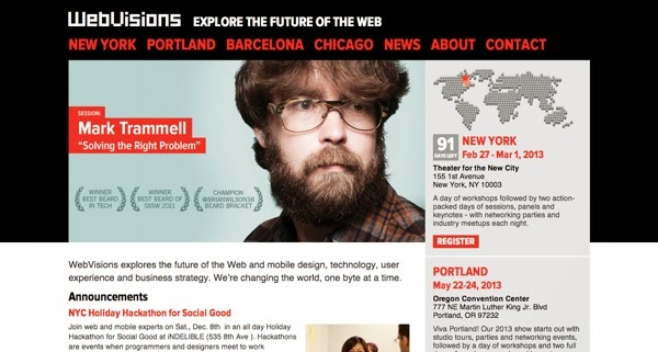
WebVisions looks to the future. Over 4 events (three in the US, one in Europe), the conference explores business strategy, user experience and content creation and how these things are constantly changing.
Converge promises a conference for "designers and developers who want to explore the mysteries of the web" – which it does through intensive half- and full-day sessions, in multiple venues all across Columbia. In 2013, participants heard inspirational talks from Chris Coyier, Grey Hoy and James White.

Le Web London
Le Web London is back for the year 2013 with the concept of Digital "Hippies" – people creating a global marketplace where ideas and creations are shared openly, without the usual focus on money.

IUI Conf
The first IUI Conference, all the way back in 1997, was conceived as a highly selective program focusing on quality. After all these years, the focus remains the same, and the program of excellent speakers will help to inspire the next wave of research into Intelligent User Interfaces.

Interaction
Toronto is Canada’s largest center for design, and is the perfect place to host the Interactionconference. Already breaching 10 years since the founding of IxDA, the web conference celebrates the interaction design community with various workshops, sessions, panel discussions, "Idea Markets", and more.

An Event Apart
An Event Apart was founded by Eric Meyer and Jeffrey Zeldman, and is dedicated to the idea that creators of great web experiences deserve a great learning experience. Every event, happening all over the US, promises to be just that – with a range of speakers and sessions all happening in the one room.

Mobile+Web DevCon
This mobile conference is split over three days, with the main conference happening over two. Prior to the conference, atendees can take part in the Labs, where they can learn a range of skills from mobile design and client/server iOS apps, to getting your teeth into JavaScript (for any designers who have previous steered clear!)

WebVisions
WebVisions looks to the future. Over 4 events (three in the US, one in Europe), the conference explores business strategy, user experience and content creation and how these things are constantly changing.

WordCamp Central
WorldCamp events are informal, community-organised gatherings put together by WordPress enthusiasts all over the world. Every conference brings together a great mix of industry professionals, lead developers and casual users to share ideas, inspire and learn from each other.
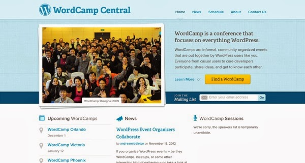
WorldCamp events are informal, community-organised gatherings put together by WordPress enthusiasts all over the world. Every conference brings together a great mix of industry professionals, lead developers and casual users to share ideas, inspire and learn from each other.

DLD
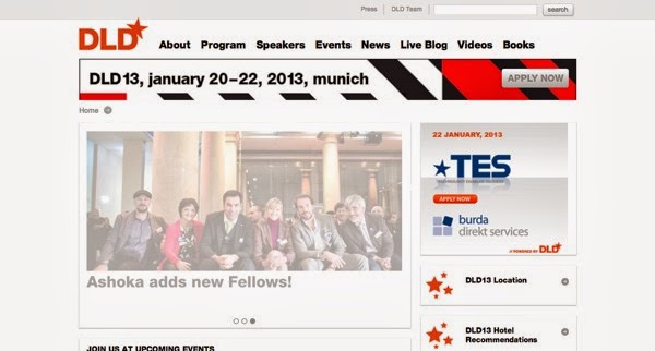
Digital-Life-Design is a global network focused on innovation, science, digitization and culture. The conference will bring together 150 speakers and 800 attendees to discuss the interconnection of business and technology.
TakeOff Conf
TakeOff focuses on what the trending topics will be for the coming year, covering everything from pure front end development and design to new web frameworks and languages, to look at how the web will evolve in our near furture, and what we can do along the way.

The Design Of Understanding
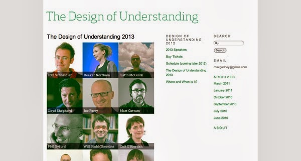
The more people can understand an idea, and the easier that understanding comes, the greater the idea. Design Of Understanding conference focuses on this point, beginning with Information Design and looking beyond into related fields, with speakers from media, sport, defence and literature as well as technology.
Jfokus
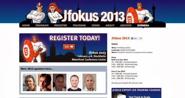
Jfokus (as the name suggests) focuses on JavaScript, and is arranged together with Javaforum, a Swedish developer community and an official Java User Group. Speakers at the Jfokus conference come from all across the world, from leading universities to cutting-edge software companies, whose talks center on system development with JS and the surrounding technologies.
Digital-Life-Design is a global network focused on innovation, science, digitization and culture. The conference will bring together 150 speakers and 800 attendees to discuss the interconnection of business and technology.

TakeOff Conf
TakeOff focuses on what the trending topics will be for the coming year, covering everything from pure front end development and design to new web frameworks and languages, to look at how the web will evolve in our near furture, and what we can do along the way.

The Design Of Understanding
The more people can understand an idea, and the easier that understanding comes, the greater the idea. Design Of Understanding conference focuses on this point, beginning with Information Design and looking beyond into related fields, with speakers from media, sport, defence and literature as well as technology.

Jfokus
Jfokus (as the name suggests) focuses on JavaScript, and is arranged together with Javaforum, a Swedish developer community and an official Java User Group. Speakers at the Jfokus conference come from all across the world, from leading universities to cutting-edge software companies, whose talks center on system development with JS and the surrounding technologies.

Download Web Videos To Your IPhone For Free With VDownload
Ever stumbled upon a viral or a long tech related video which you would play again and again to rewatch (say when you’re travelling and away from data connection) or show to friends? Androiddevices might have it more flexible when it comes to downloading a video onto the device but for iOS devices and users, it’s always "there’s an app for that"
 |
Video Download Free does exactly what its name implies: it allows you to download videos off websites to your iOS devices. It’s also very simple to use and the best part is it’s free. Here’s how you can enjoy your videos offline on your iPhone or any other iOS device.
Using VDownload
Video Download Free will show as VDownload on your iOS device after installation. The app has abuilt-in web browser where you can download videos from certain websites.
There are 2 methods to download videos off websites. The method varies between the websites so you’ll have to experiment.
 |
To download just press the browser’s middle button at the bottom then choose Save Videos.
 |
On some sites you may have to play the video first, where it’ll then prompt you to Cache Video to Memory aka download it.
 |
You can see the download progress by tapping the Downloads button. Once it is finished, you can find and watch it under Videos. Although the app has ads as you navigate through the website, you won’t see any while watching your downloaded videos.
 |
Some videos might be named in code after downloading it, but you can easily rename it, or categorize it under folders. You can also save it to your device’s photo gallery by tapping on Save to Albums.
 |
Conclusion
We tested the app on a few websites and found that you can download videos from YouTube,Instagram, Vine, MetaCafe and CollegeHumour. Websites that are not supported are Vimeo, Blip.TV and DailyMotion.
Keep Calm & Love Your Web Designers [Posters]
Web designers have a lot to deal with and we’re not just talking about the work that they are doing. Malfunctions, miscommunications, subjective tastes, colors that are not colors, micro-managers, fickle trends, bosses that don’t get it, clients that refuse to get it, and the list goes on.
(Image Source: Alan Guzman)
Perhaps, that is why there are so many of these Keep Calm and [insert tongue-in-cheek solution here] posters around to keep our collective chins up. Here are 12 Keep Calm posters that let you have a good glimpse into the designer’s daily struggles. And to all our beloved web designers, we share your pain(!) and we salute your courage to soldi
Keep Calm and Carry On. Having a bad day with designer’s block? Just keep calm and carry on!(Image Source: Graham Phisher)
Keep Calm and Save Often. It’s the oldest rule in the book, because if you don’t, well, we’ll let thisTwitter stream say the rest. (Image Source: Alex Jane Art)
Keep Calm and CMD+Z. Previously known as the Undo button, this is the command that we wish to have a real-life counterpart to. (Image Source: Paweł Kadysz)
Keep Calm And Use The Force Quit. Then, breathe! Breathe like Vader! (Image Source: ron-guyatt)
Keep Calm And CTRL+ALT+DEL. You win some, you lose some, but if you stay calm, you can start again. (Image Source: Keep Calm And Posters)
Keep Calm And Google It. Don’t you feel all warm inside knowing that Google has your back?(Image Source: Manish Mansinh)
Keep Calm And Look Busy. If you ever wonder what the real purpose for social networks is, there you have it. Someone’s coming, look busy! (Image Source: Manish Mansinh)
Keep Calm And Make The Logo Bigger. Sometimes the client from hell deserves a chair in the face. Other times, we should just watch our blood pressure and make the logo bigger. (Image Source: Eleonora Anzini)
Keep Calm And Lorem Ipsum. They say a web designer’s experience is proportional to how much Lorem Ipsum he can recall. I can do… Lorem ipsum dolor sit amet. Good enough. (Image Source:Eleonora Anzini)
Keep Calm And Type On. Once the type is on, it’s hard to not spend a night perfecting its kerning.(Image Source: Alan Guzman)
Keep Calm And Flip A Table. Keep an extra table nearby just to flip it when things go south, then carry on soldier. (Image Source: Keep Calm-o-matic)
Keep Calm And Redesign The Web. Too many mobile devices to support? HTML5 and Responsive Web Design to the rescue. All hail HTML5! (Image Source: Vinícius de Thomaz Domingues)
Got your own piece of Keep Calm quote to share with us? You know what to do!


