Showing posts with label design. Show all posts
Modern Kitchen Design Ideas
When it comes to the kitchen; it has to be perfect. The family kitchen is not just a place for preparing food, it’s much more than that; it’s the place where the whole family loves to meet and share enjoyable moments together. The family kitchen should mainly be practical, thoughtful but also decorative. But what are the secrets or the essential keys for the perfect kitchen? Well, there are 3 necessary elements to consider: a perfect kitchen is the one which is functional, good looking and most of all comfortable
Discover ideas for a modern yet comfortable kitchen design through the pictures below. As we mentioned before, an excellent kitchen designing should be, before all, functional; this is a very important point because the practicality could be the most necessary thing in the kitchen. A practical kitchen is the one designed to accommodate all kitchen tools & equipment in a smart way that provides easy usage without occupying too much space.
Prefer storage cabinets close at hand for utensils, shelves placed above the worktop will avoid endless going & coming, XXL drawers are the best to store electrical appliances such as the deep fryer, the kitchen machine or robot. The L shape is the most common in kitchen layouts; the problem of this arrangement is that you lose the place at the right angle. Then save space by adopting the sink area in the corner; this way you will have more free space on your worktop. By creating a practical and well organized kitchen, you will achieve like 90% of the aim which is “a comfortable kitchen”, and all what is remaining now is the look; this depends only on your taste and preferences. Don’t hesitate to apply the decorating style you like because it’s you who is going to spend a lot of time in this place so it has to be good looking and satisfying your taste. Choose the style you prefer; contemporary, minimalist, natural, retro or even traditional; since you will feel comfortable, go for it.
 |
How To Avoid Web Design Mistakes | Quicktips
Every web designer tries to design an effective website, without making any mistake. But, it is not at all mandatory that all the trials give effective results.
Some websites exists on the internet which has lots of mistakes or errors in it and these errors distract the users from the site.
Some of the common errors which designers make and due to which the users distract from the website are:
1. Unpleasant color combination
2. Too large and too small texts
3. Loading of web pages takes time
4. Pop-up windows
5. Failure in opening of external links in new browsers
Every business owner develops the website of his company with the main motive to earn profit by attracting the visitors towards their site.
In other words, they develop the website to build the reputation and credibility of the company.
To build the reputation and credibility of the company, it is necessary that, the web designer must design the website which enhances the user experience.
A visitor should feel comfortable, when he/she visits your website and he will feel comfortable only when your website is attractive and informative.
This will insists the visitor to visit your site again and again for getting updated information or more information regarding the same topic.
Described below are some of the common errors which a designer makes while designing the website.
Unpleasant Color Combinations
The websites which have appealing designs and decent color combinations are enjoyed by most of the users.
Therefore, a designer must not make use of ugly color combinations; instead they must use decent colors, which give soothing affect to the eyes.
For example. The black text with the white background gives soothing affect to the eyes and if you want to make it more attractive then you can add graphics, which will give more colorful appearance to the web page.
Too Large and Too Small Texts
It is the one of the most common mistakes which the designers make. The designers either use very small texts or very large texts on the web site.
It is true that, the use of small texts will give you the opportunity to insert a lot of information on the site, but at the same time use of small texts makes it difficult for the visitors to see or read the content, especially on the high resolution screen.
On the other hand, there are few sites, which uses too large texts, this makes the website unattractive and becomes a curse for the users using low resolution screen like 800X600 pixels.
The solution for this problem is that, you, yourself should check the text by sitting few meters away from the screen. You should be able to read the text comfortably.
Time taken for loading a web page
Every visitor clicks on the website with the hope that the website will load quickly and he will be able to see or get the information for which he is searching for.
But the designers make this mistake by adding heavy graphics or large number of graphics, which makes the loading of the page slower.
And the visitor doesn’t have the patience or the time to wait for the site to get open and that visitor skips from the website.
Therefore, it is one of the greatest problem due to which the businesses lose their online visitors. Therefore, a designer must optimize the images before placing it on the website, so that it loads much faster.
Pop Up Windows
The occurrence of the pop up windows on the site irritates and frustrates the users. The users close these windows frustratingly.
Pop up windows infect your website and give it a low quality appearance.
As a good designer, you must think that you are making the site for the user and you must see his comfortability.
Links Get Fail to Open in New Tabs
External links which don’t open in new tab, gives a very bad experience to the user. As these links enable the users to simply go to the new page without losing the previous page.
The appearance of website must be appealing to the user eyes. Therefore, web designers should design a website without any errors or mistakes and must check it before making it live on the web server.
Awesome Web Design Conferences
Editor’s note: This is a contributed post by Chris Jackson, who writes about web design trends for DesignCrowd, an online design jobs marketplace for freelance web and graphic designers. They have recently launched a design jobs marketplace in Singapore.
One of the highlights of the year for any serious web designer or developer is often the Web Conference. Every year there are more and more amazing events taking place all over the globe, from events all over the US such as the An Event Apart series to SxSW in Austin, Texas, to the Edge Of The Web conference in Australia to events like jQuery Europe and DLD in Germany.
There is something for everyone no matter where you are from. We take a look at some of these amazing web conferences and they may have for you. If you have any other conferences to add to the list, let your voice be heard in the comments section.
Note: Most of these events occur on an annual basis (sometimes a few times a year) so be sure to check their sites for details if you want to paticipate in any of them.
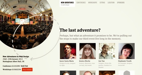
New Adventures In Web Design
New Adventures in Web Design is a focused, single-track design conference in the historic English city of Nottingham. Alongside the lineup of great speakers for 2013, there are three masterclass workshops on offer from industry legends Sarah Parmenter, Andy Clarke and Steph Hay.
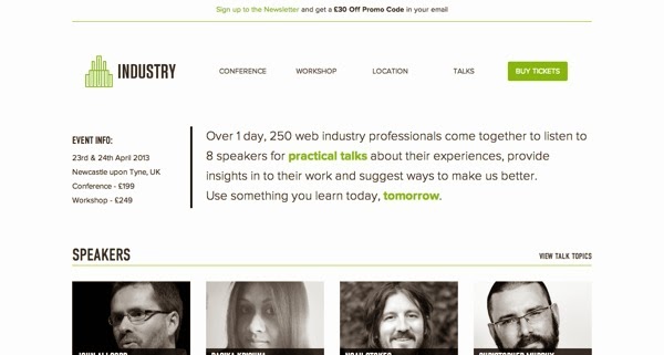
Industry Conf
Industry is the brainchild of conference veteran Gavin Elliott, organiser of the incredibly popular DIBI Conference in 2010 and 2011. The event will feature 8 diverse web professionals giving practical talks and giving you the tools to use what you learn from the conference in your own work.
Industry is the brainchild of conference veteran Gavin Elliott, organiser of the incredibly popular DIBI Conference in 2010 and 2011. The event will feature 8 diverse web professionals giving practical talks and giving you the tools to use what you learn from the conference in your own work.

Altitude
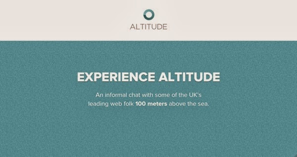
Altitude is a unique event set in a unqiue location: 100 meters above sea level in Portsmouth’s Spinnaker Tower! Web entrepreneur Paul Boag interviews 4 leading figures from four different disciplines – development, design, accesibility, and iOS design – giving conference-goers a broad and insightful view of the industry.
Altitude is a unique event set in a unqiue location: 100 meters above sea level in Portsmouth’s Spinnaker Tower! Web entrepreneur Paul Boag interviews 4 leading figures from four different disciplines – development, design, accesibility, and iOS design – giving conference-goers a broad and insightful view of the industry.

Port80
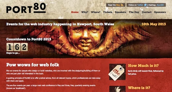
Port80 is organised by Joel Hughes and is Wales’ first web design conference (in 2013). Alongside the yearly main event, there are Localhost events, low-cost evenings that happen three times a year.
Port80 is organised by Joel Hughes and is Wales’ first web design conference (in 2013). Alongside the yearly main event, there are Localhost events, low-cost evenings that happen three times a year.

SxSW Interactive
SxSW is one of the most well-known conferences anywhere in the world, featuring cutting edge music, film and digitil/interactive technologies year on year. Its scale and scope can be daunting to the newcomer, and the handy First Timer’s Guide is a good place to start for the uninitiated.
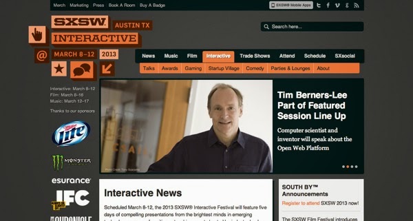
SxSW is one of the most well-known conferences anywhere in the world, featuring cutting edge music, film and digitil/interactive technologies year on year. Its scale and scope can be daunting to the newcomer, and the handy First Timer’s Guide is a good place to start for the uninitiated.

Converge SE
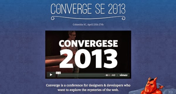
Converge promises a conference for "designers and developers who want to explore the mysteries of the web" – which it does through intensive half- and full-day sessions, in multiple venues all across Columbia. In 2013, participants heard inspirational talks from Chris Coyier, Grey Hoy and James White.
Le Web London
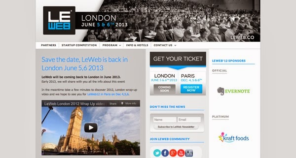
Le Web London is back for the year 2013 with the concept of Digital "Hippies" – people creating a global marketplace where ideas and creations are shared openly, without the usual focus on money.
IUI Conf
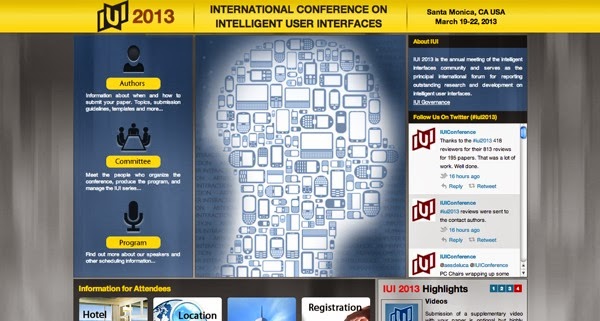
The first IUI Conference, all the way back in 1997, was conceived as a highly selective program focusing on quality. After all these years, the focus remains the same, and the program of excellent speakers will help to inspire the next wave of research into Intelligent User Interfaces.
Interaction
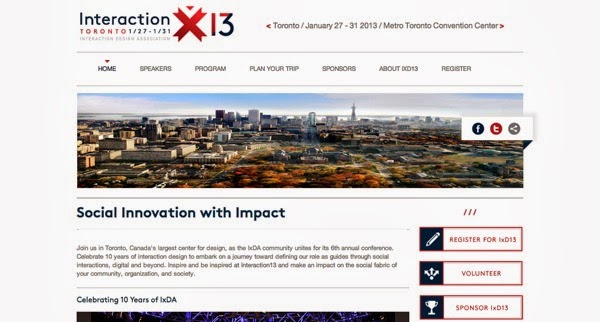
Toronto is Canada’s largest center for design, and is the perfect place to host the Interactionconference. Already breaching 10 years since the founding of IxDA, the web conference celebrates the interaction design community with various workshops, sessions, panel discussions, "Idea Markets", and more.
An Event Apart
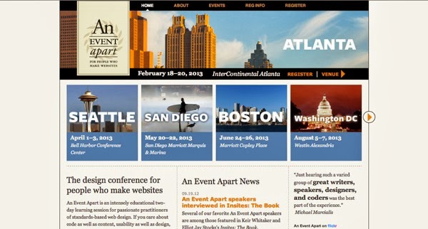
An Event Apart was founded by Eric Meyer and Jeffrey Zeldman, and is dedicated to the idea that creators of great web experiences deserve a great learning experience. Every event, happening all over the US, promises to be just that – with a range of speakers and sessions all happening in the one room.
Mobile+Web DevCon
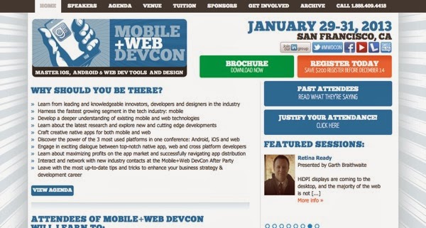
This mobile conference is split over three days, with the main conference happening over two. Prior to the conference, atendees can take part in the Labs, where they can learn a range of skills from mobile design and client/server iOS apps, to getting your teeth into JavaScript (for any designers who have previous steered clear!)
WebVisions
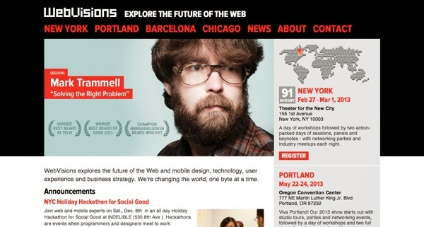
WebVisions looks to the future. Over 4 events (three in the US, one in Europe), the conference explores business strategy, user experience and content creation and how these things are constantly changing.
Converge promises a conference for "designers and developers who want to explore the mysteries of the web" – which it does through intensive half- and full-day sessions, in multiple venues all across Columbia. In 2013, participants heard inspirational talks from Chris Coyier, Grey Hoy and James White.

Le Web London
Le Web London is back for the year 2013 with the concept of Digital "Hippies" – people creating a global marketplace where ideas and creations are shared openly, without the usual focus on money.

IUI Conf
The first IUI Conference, all the way back in 1997, was conceived as a highly selective program focusing on quality. After all these years, the focus remains the same, and the program of excellent speakers will help to inspire the next wave of research into Intelligent User Interfaces.

Interaction
Toronto is Canada’s largest center for design, and is the perfect place to host the Interactionconference. Already breaching 10 years since the founding of IxDA, the web conference celebrates the interaction design community with various workshops, sessions, panel discussions, "Idea Markets", and more.

An Event Apart
An Event Apart was founded by Eric Meyer and Jeffrey Zeldman, and is dedicated to the idea that creators of great web experiences deserve a great learning experience. Every event, happening all over the US, promises to be just that – with a range of speakers and sessions all happening in the one room.

Mobile+Web DevCon
This mobile conference is split over three days, with the main conference happening over two. Prior to the conference, atendees can take part in the Labs, where they can learn a range of skills from mobile design and client/server iOS apps, to getting your teeth into JavaScript (for any designers who have previous steered clear!)

WebVisions
WebVisions looks to the future. Over 4 events (three in the US, one in Europe), the conference explores business strategy, user experience and content creation and how these things are constantly changing.

WordCamp Central
WorldCamp events are informal, community-organised gatherings put together by WordPress enthusiasts all over the world. Every conference brings together a great mix of industry professionals, lead developers and casual users to share ideas, inspire and learn from each other.
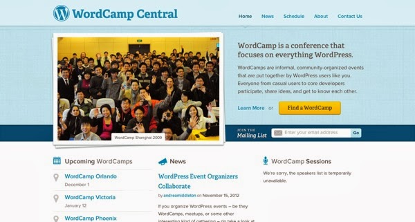
WorldCamp events are informal, community-organised gatherings put together by WordPress enthusiasts all over the world. Every conference brings together a great mix of industry professionals, lead developers and casual users to share ideas, inspire and learn from each other.

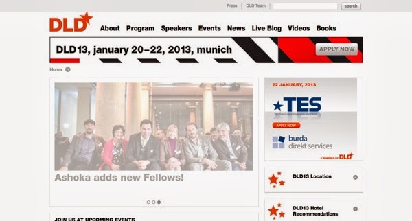
DLD
Digital-Life-Design is a global network focused on innovation, science, digitization and culture. The conference will bring together 150 speakers and 800 attendees to discuss the interconnection of business and technology.
TakeOff Conf
TakeOff focuses on what the trending topics will be for the coming year, covering everything from pure front end development and design to new web frameworks and languages, to look at how the web will evolve in our near furture, and what we can do along the way.
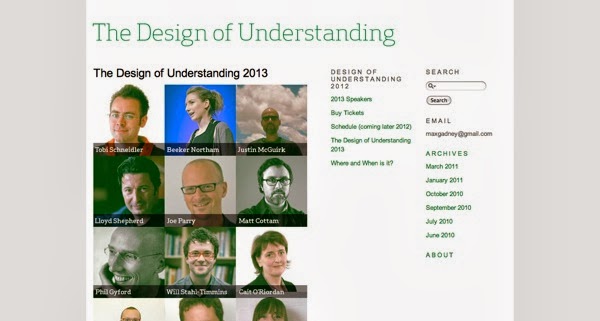
The Design Of Understanding
The more people can understand an idea, and the easier that understanding comes, the greater the idea. Design Of Understanding conference focuses on this point, beginning with Information Design and looking beyond into related fields, with speakers from media, sport, defence and literature as well as technology.
Jfokus
Jfokus (as the name suggests) focuses on JavaScript, and is arranged together with Javaforum, a Swedish developer community and an official Java User Group. Speakers at the Jfokus conference come from all across the world, from leading universities to cutting-edge software companies, whose talks center on system development with JS and the surrounding technologies.
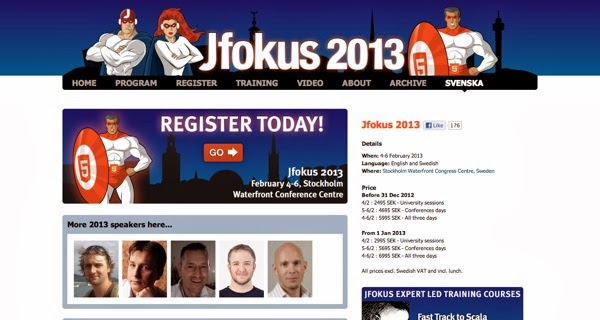
Digital-Life-Design is a global network focused on innovation, science, digitization and culture. The conference will bring together 150 speakers and 800 attendees to discuss the interconnection of business and technology.

TakeOff Conf
TakeOff focuses on what the trending topics will be for the coming year, covering everything from pure front end development and design to new web frameworks and languages, to look at how the web will evolve in our near furture, and what we can do along the way.

The Design Of Understanding
The more people can understand an idea, and the easier that understanding comes, the greater the idea. Design Of Understanding conference focuses on this point, beginning with Information Design and looking beyond into related fields, with speakers from media, sport, defence and literature as well as technology.

Jfokus
Jfokus (as the name suggests) focuses on JavaScript, and is arranged together with Javaforum, a Swedish developer community and an official Java User Group. Speakers at the Jfokus conference come from all across the world, from leading universities to cutting-edge software companies, whose talks center on system development with JS and the surrounding technologies.

Design A Web 2.0 Tab With Photoshop
The follow guide below attempts to give you an idea how to design a nice sleek tab menu in Photoshop, Web 2.0 style.
Step 1
Create a new canvas with white[#ffffff] background at any size you like, preferably rectangular; they are more suitable to draw tabs. Then switch to Channels Tab (Windows -> Channels), click Create new channel on bottom right.
Step 2
On the channel layer selected, draw similar shape with Polygonal Lasso tool. Fill it up with white color[#ffffff]; unselect the Polygonal region (select any Marquee tool and hit the screen one); give the shape Gaussian Blur with radius 6.0px.
Step 3
CTRL-L to call up the Level Dialog and push the left and right arrow to meet the center arrow, like the image above. This will “smooth” your blur-ed shape up and give you a nice rounded corner shape.
Step 4
In Channels Tab, Hold CTRL, click on Channel Thumbnail of layer Alpha 1. The new shape will now be selected, switch back to Layers Tab, Create New Layer and fill the selected area with black [#000000].
Step 5
Remove rounded corners for bot bottom left and bottom right, move it towards the left and position it as illustrated above. Next we will focus on the black color Tab.
Hold CTRL, click on tab’s Layer Thumbnail to get the entire tab image highlighted.
With the tab image still highlighted, select Rectangular Marquee Tool, hold ALT and draw a rectangular of region we want to remove.
You should only see the top part selected. Select -> Modify ->Contract, Contract by 2px and you should get something like the image on the left.
Create a new layer, fill the highlighted region with white[#ffffff]. Right click, choose Blending Options then Gradiant Overlay. Replace the white[#ffffff] color stop with gray[#616161]. Your tab should look like the image on the left.
Step 6
Create a new layer; Select Rounded rectangular Tool (Radius 8px), draw a rectangular and put this layer behind the black tab layer. Right click and select Blending Options and insert the following settings.
Drop Shadow
Opacity: 31%
Distance: 0px
Spread: 0%
Size: 2px
Bevel and Emboss
Depth: 100%
Size: 0px
Soften: 0px
Gradiant Overlay
Here are the Color stops settings.
Color: #aaaaaa, Location: 0%
Color: #ffffff, Location 100%
Step 7
Put in some text to see the overall web 2.0 look. I’m using font Lucida Fax, font-size 32pt and 25pt. And your tab is done! Feel free to play around with the Tab’s colors combination.


+-+Copy.jpg)


